Soccer Jersey Badge Placement Basics
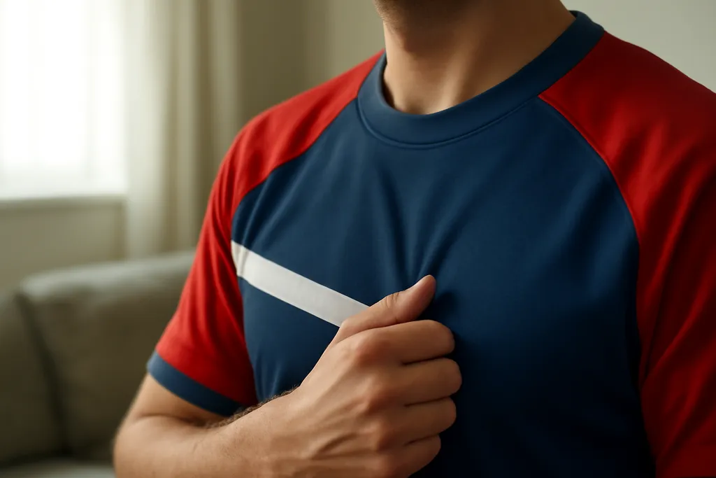
The team crest or badge is most commonly placed on the upper chest, usually over the left side from the wearer’s perspective. That position has become the standard in many soccer kits because it creates a clear focal point without interfering with the center of the shirt.
Some designs shift the crest slightly depending on collar shape, sponsor layout, or pattern placement, but the upper-chest zone remains the most common convention. If you are comparing jerseys, this is usually the first place to look when identifying how the shirt is structured.
Sponsor Marks and Secondary Badges
Secondary badges, such as manufacturer logos or sleeve patches, are often arranged to complement the crest rather than compete with it. A manufacturer mark is frequently placed on the opposite chest side, while sponsors are often centered on the front of the shirt. This creates a simple visual hierarchy: crest first, sponsor second, and supporting marks around the edges.
Sleeve badges can also appear on one or both arms, depending on the competition or style of jersey. These placements are practical because they keep extra identifiers visible without crowding the main design area on the chest.
Match Patches, Patches, and Special Editions
Competition patches and commemorative badges are usually placed in limited, predictable areas. You may see a patch on one sleeve, a small badge near the chest, or a special mark integrated into the lower hem or inside label area. These details are often subtle, especially on modern kits that rely on clean lines and minimal clutter.
Special edition jerseys can take more creative liberties, but even then the crest and major identifiers usually stay in familiar positions. That balance between tradition and design helps maintain the recognizable look that many fans expect.
Browse our recommended gear
Our featured picks refresh periodically. While we update them, our editorial buying guides can help you find the right jersey.
See our buying guidesHow Placement Differs by Jersey Style
Replica, authentic-style, and training jerseys may handle badge placement differently. A match-style shirt may include more detailed patches or heat-applied elements, while a simpler fan jersey may focus on the core crest and sponsor. Youth and casual versions can also use slightly different proportions, which changes how large a badge appears relative to the rest of the shirt.
Fabric texture matters too. On smoother materials, badges can sit very flat and clean. On textured or performance-focused fabrics, the same elements may look more integrated into the shirt surface. That is why two jerseys with the same general layout can still feel visually different.
What to Look for When Choosing a Jersey
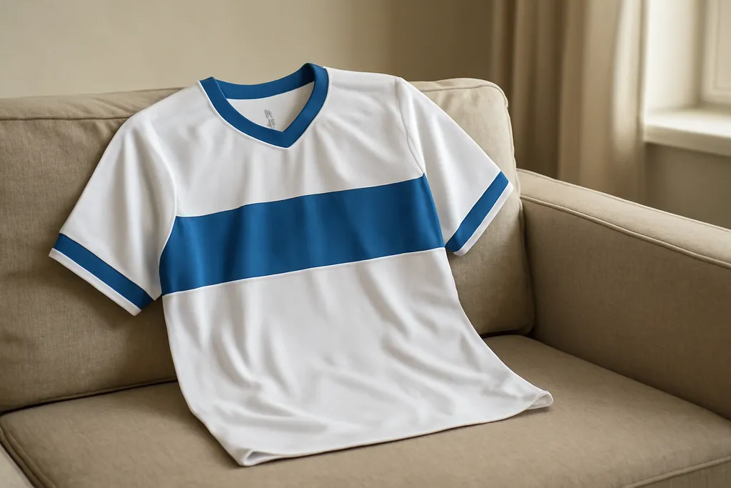
If you care about soccer jersey badge placement, pay attention to the balance of the whole front panel. A well-placed crest should feel natural, with sponsor and sleeve elements arranged so the shirt still looks coherent. Looking at product photos from straight-on angles can help you judge whether the badge positions match your preference.
It also helps to consider how you plan to wear the jersey. For display, collecting, or everyday use, badge placement may influence the overall look more than any single design detail. When the layout works, the jersey feels polished, readable, and true to the style of the game.