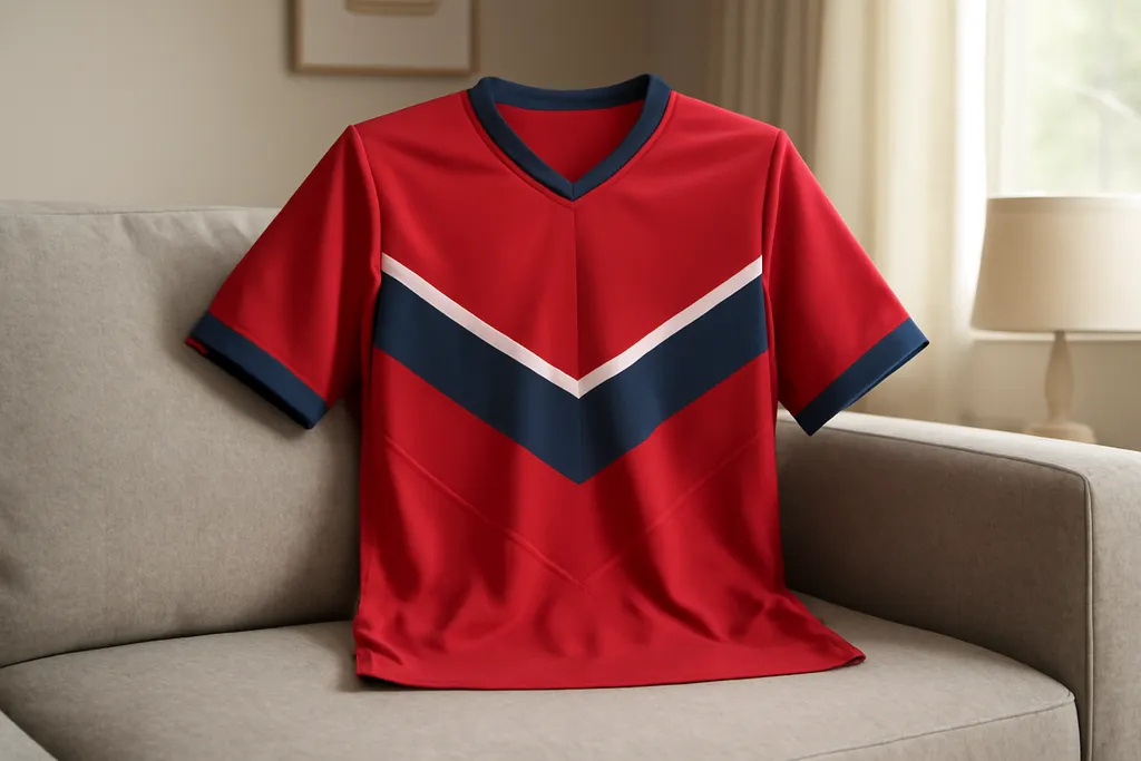

Home vs Away Hockey Jersey Color Conventions
The phrase home vs away hockey jersey colors usually refers to the standard way teams separate their main jersey looks for games played at home and on the road. In many hockey settings, one jersey is treated as the primary home option and the other as the contrasting away option. The goal is simple: make it easy to tell teams apart on the ice while keeping each club’s identity clear.
Although the exact setup can vary by league, era, or team preference, the basic idea is consistent. One jersey is typically darker or more visually prominent, while the other is lighter or designed for stronger contrast. Fans shopping for jerseys often use these color conventions to choose a version that matches their favorite game-day look or the style they see most often on television.
How the Convention Usually Works
In many hockey leagues, home teams are responsible for providing contrast, which historically led to a familiar split between dark and light jerseys. Some organizations use dark jerseys at home and light jerseys on the road, while others follow the opposite approach depending on league rules and current team policy. The important part is not the exact shade, but that the two jerseys are different enough to avoid confusion during play.
This is why you may see fans referring to “home colors” and “away colors” as if they are fixed categories. In practice, they are a convention, not a universal rule. A team may also introduce alternate jerseys, special-event designs, or outdoor-game looks that sit outside the standard home and away rotation.
Why Color Contrast Matters
Hockey moves quickly, so strong visual contrast helps players, officials, broadcasters, and fans track the action. Jersey color differences make it easier to identify teammates, read passing lanes, and follow line changes. For viewers, the contrast also improves broadcast clarity, especially when arena lighting or camera angle makes smaller details harder to see.
From a fan perspective, color contrast also shapes the look and feel of a jersey collection. A bold home jersey may feel more energetic and iconic, while a lighter away jersey can have a cleaner, classic appearance. Many collectors like owning both versions because each one captures a different side of the team’s identity.
Browse our recommended gear
Our featured picks refresh periodically. While we update them, our editorial buying guides can help you find the right jersey.
See our buying guidesWhat Shoppers Should Look For
If you are comparing home vs away hockey jersey colors before buying, start with the team’s current jersey setup rather than assuming every club follows the same pattern. Some teams keep long-running color traditions, while others change templates over time. Photos from recent games, product listings, and team media can help you tell which version is which.
It also helps to think about where and how you plan to wear the jersey. Darker jerseys often show wear differently than lighter ones, and certain colorways may pair better with hats, jackets, or casual outfits. If you want a specific game look, match the jersey to the version you see most often in home or road broadcasts.
A Simple Rule of Thumb
When in doubt, remember this: home and away hockey jersey colors are mainly about contrast and tradition, not a single universal color code. The “home” jersey is the one a team commonly associates with its home games, and the “away” jersey is the contrasting version used on the road. Exact arrangements can differ, so checking the team’s current setup is the safest way to know what you are buying.
For fans and collectors, that flexibility is part of the appeal. It gives you more than one way to represent the same team, whether you prefer the look of a dark primary jersey or a lighter road style.